Organix
Sonya Mudvex - art-director, graphic designer | Mark Kholodaev - senior graphic designer | Ekaterina Ermolinskaya - junior graphic designer
About
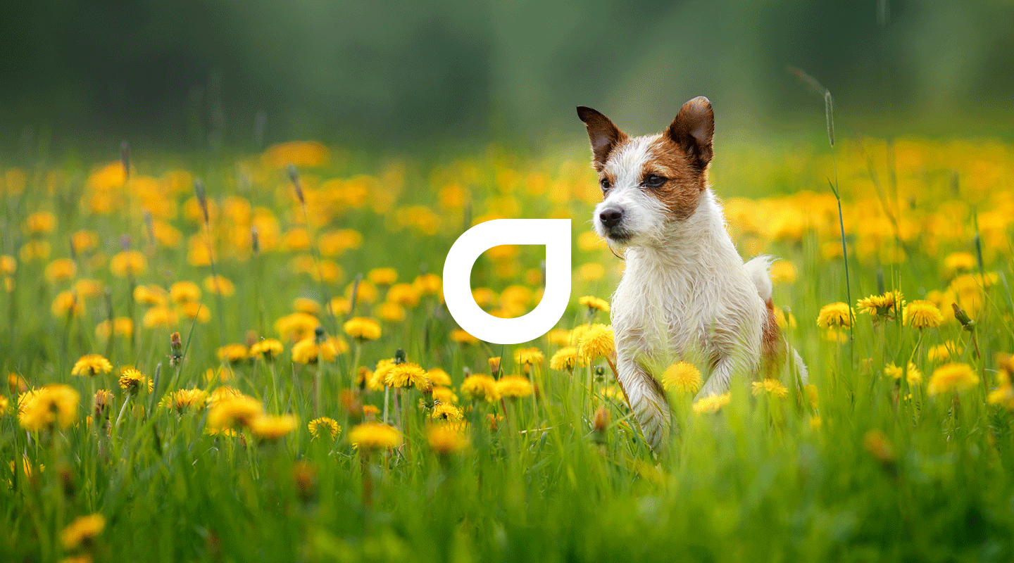
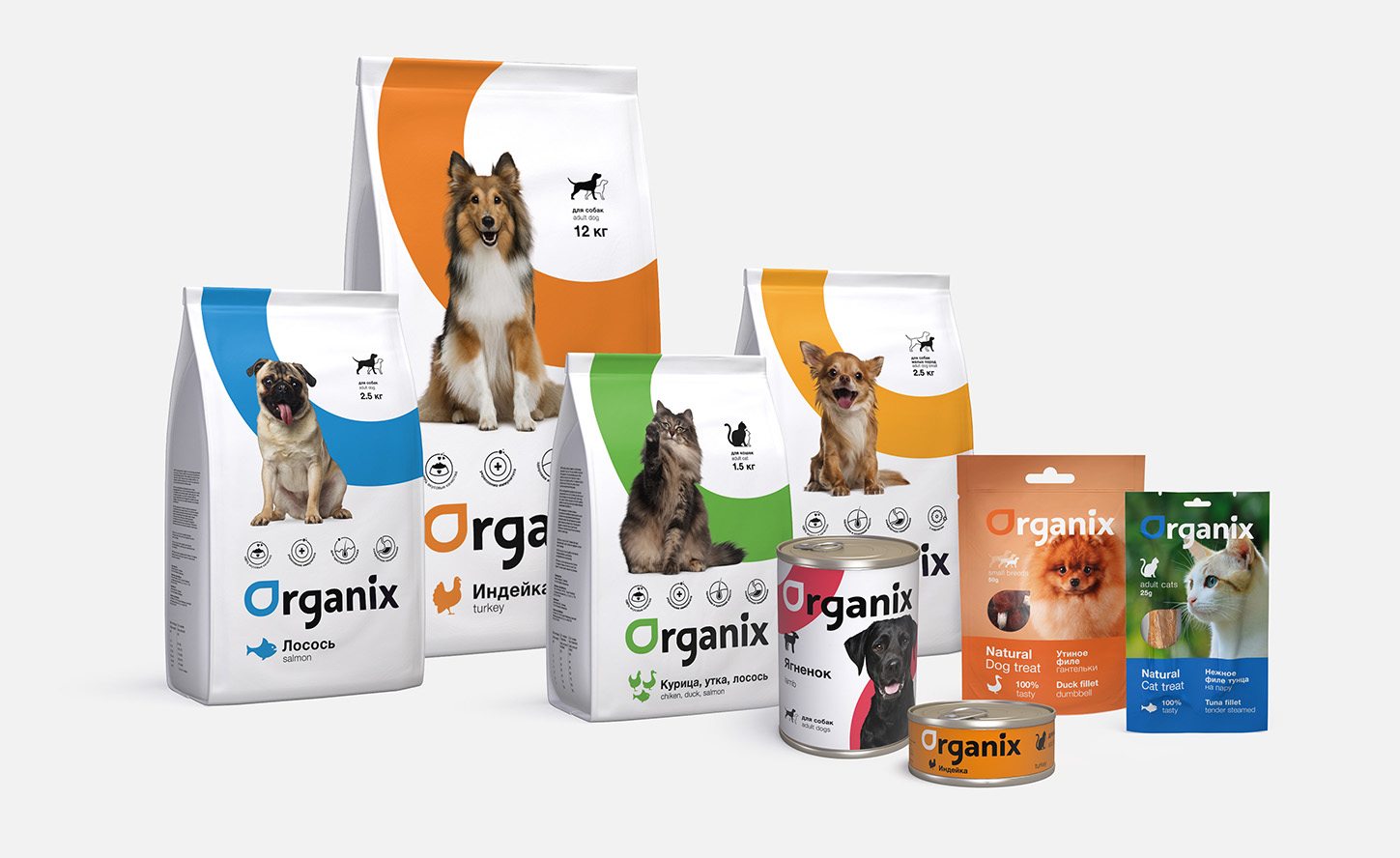
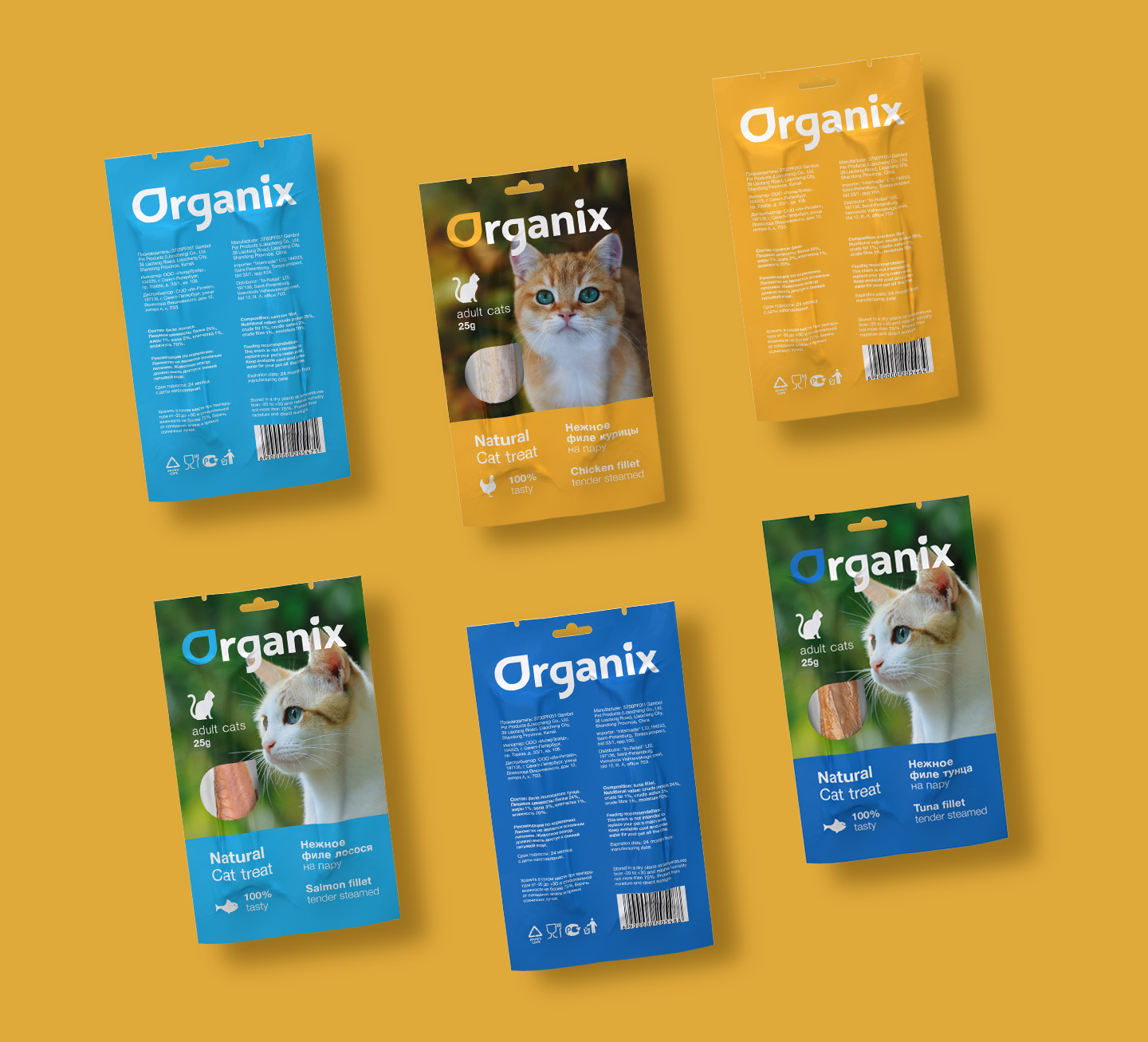
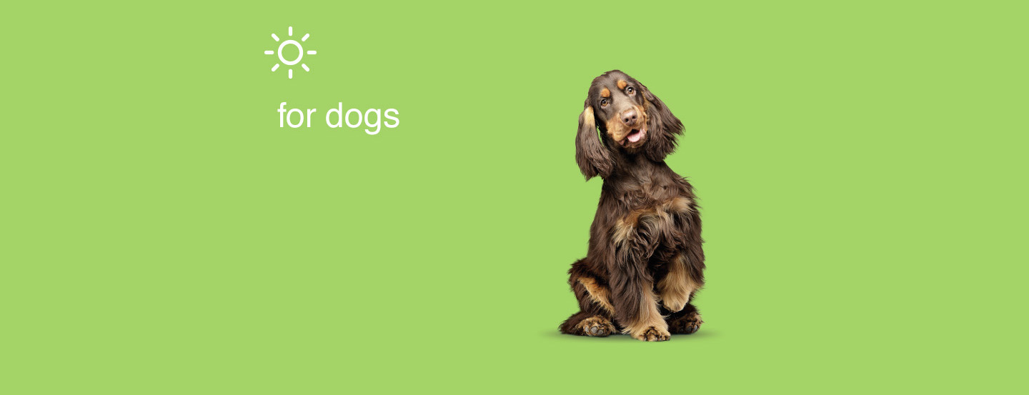
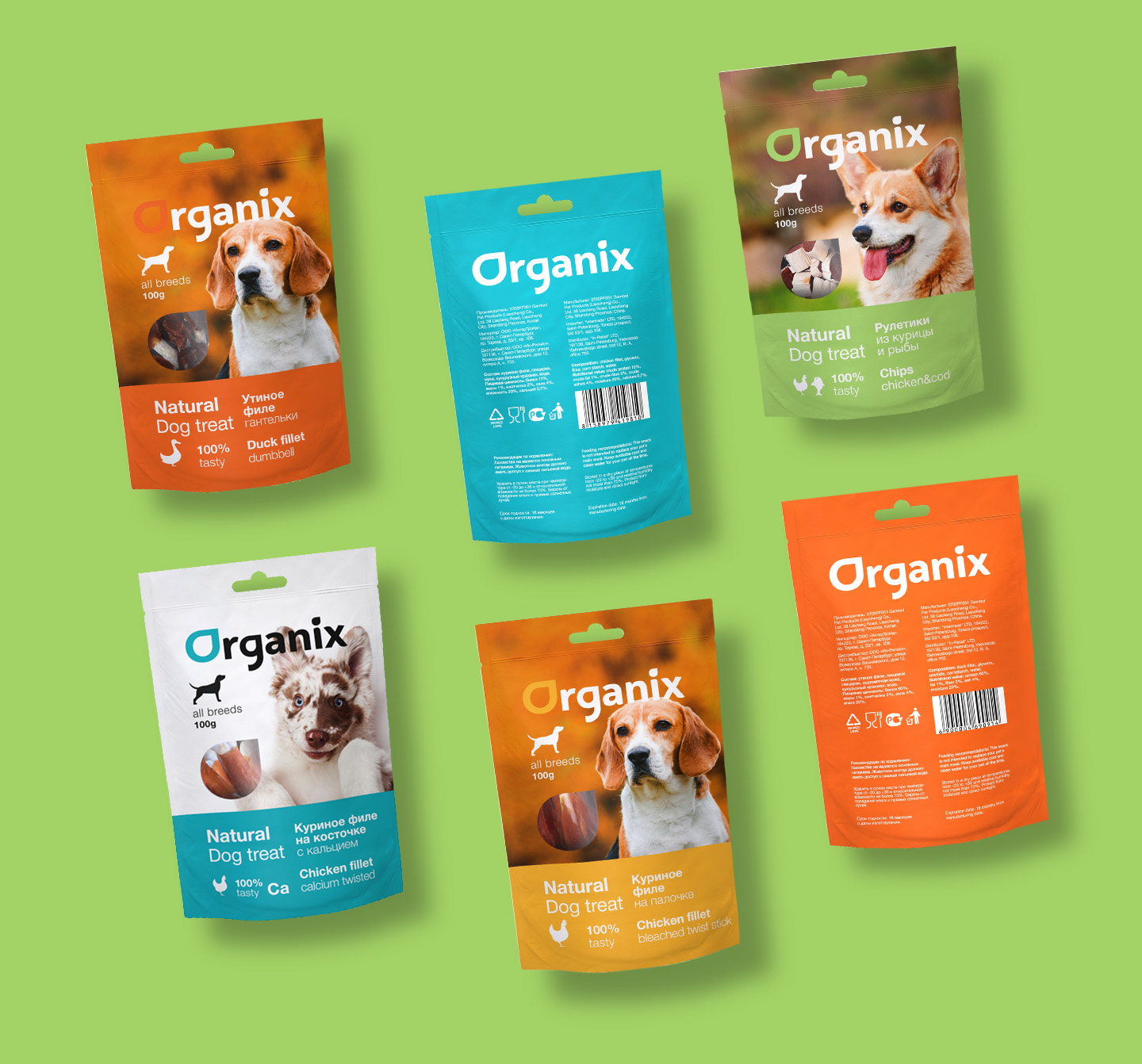
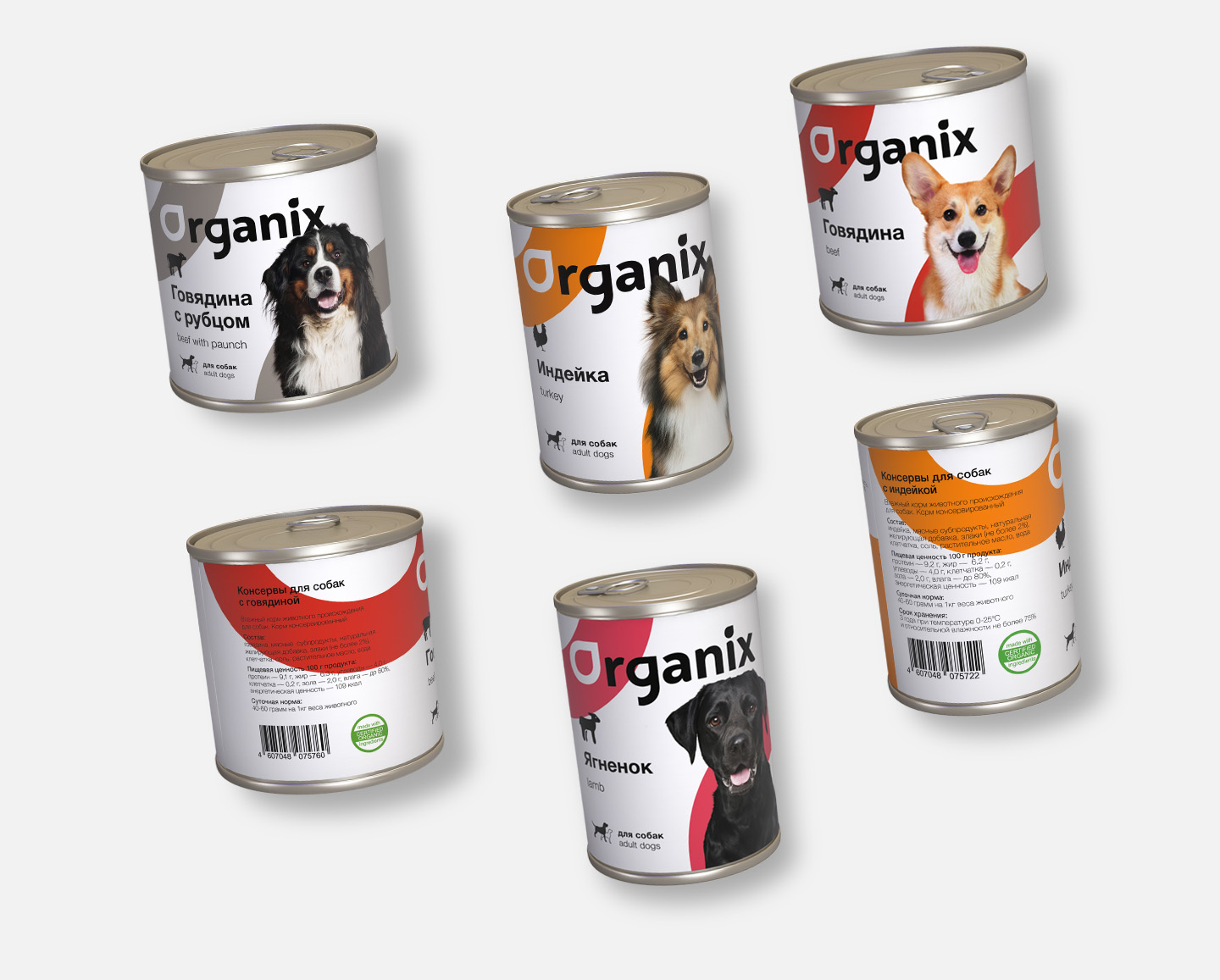
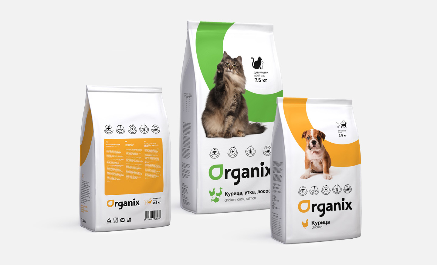
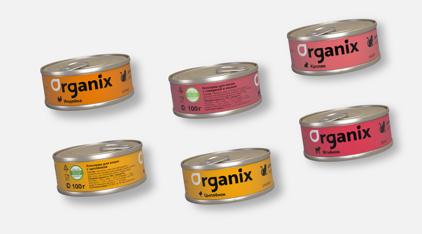
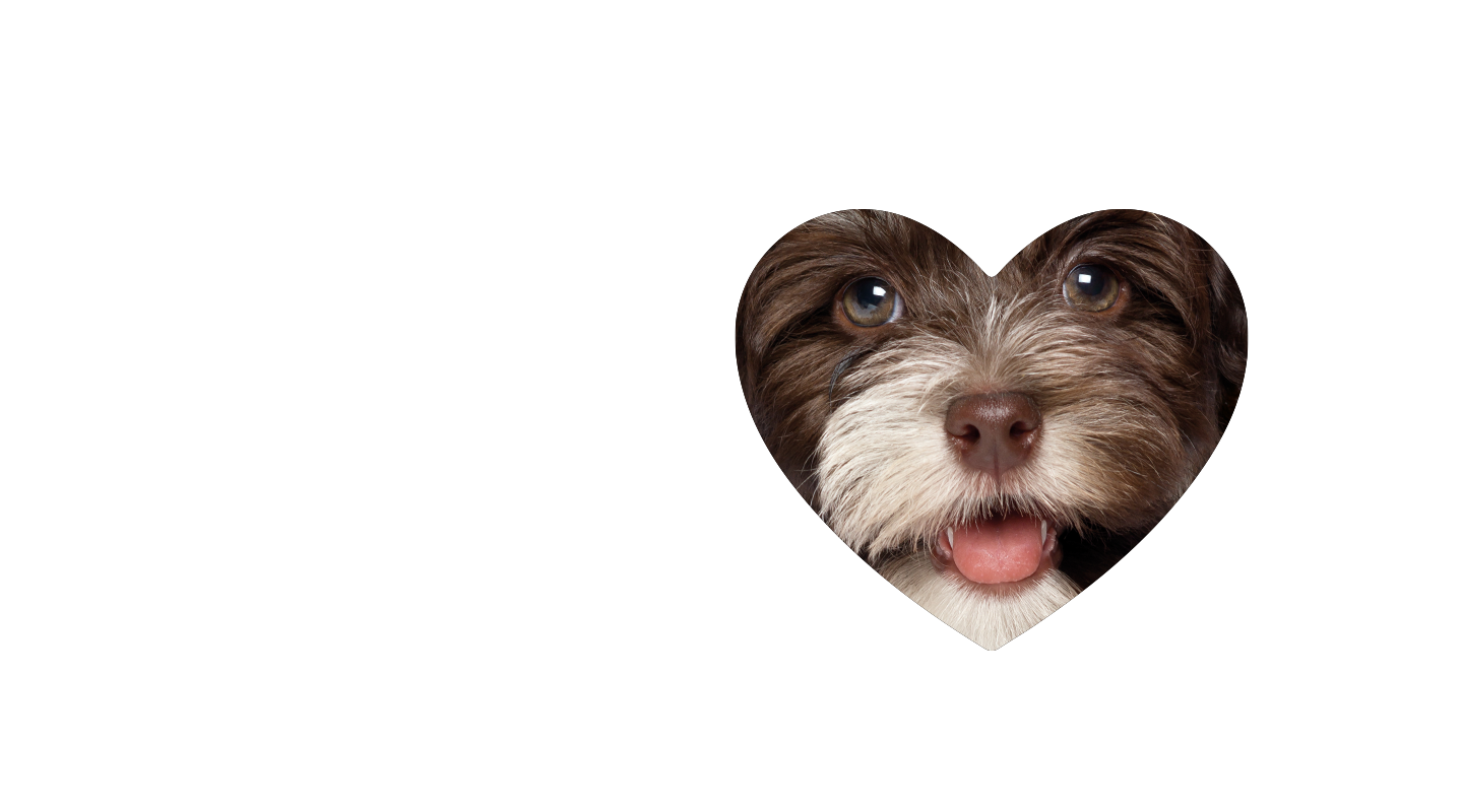
Organix is a well-known brand among russian pet owners. It has a lot of product lines: dry food, treats, pouches and canned food. With such a diverse assortment brand covers all the needs in a complex pet feeding industry. One of Organix's main objectives was showing that they produce quality dog and cat food. The composition of the feed allows the pet owner to not worry about possible allergy or harmful ingredients. It contains no wheat, preservatives, colour additives or flavor enhancers 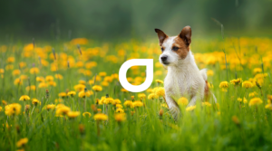 .
.
Logotype
The old logo was about what you would expect from the naming "Organix" - green font colour, leaf and a paw inside as a sign that this is animal feed. The new logo, by contrast, refuses typical signs and designations, using advanced letter sign and strict black font. Look below "before" and "after" .
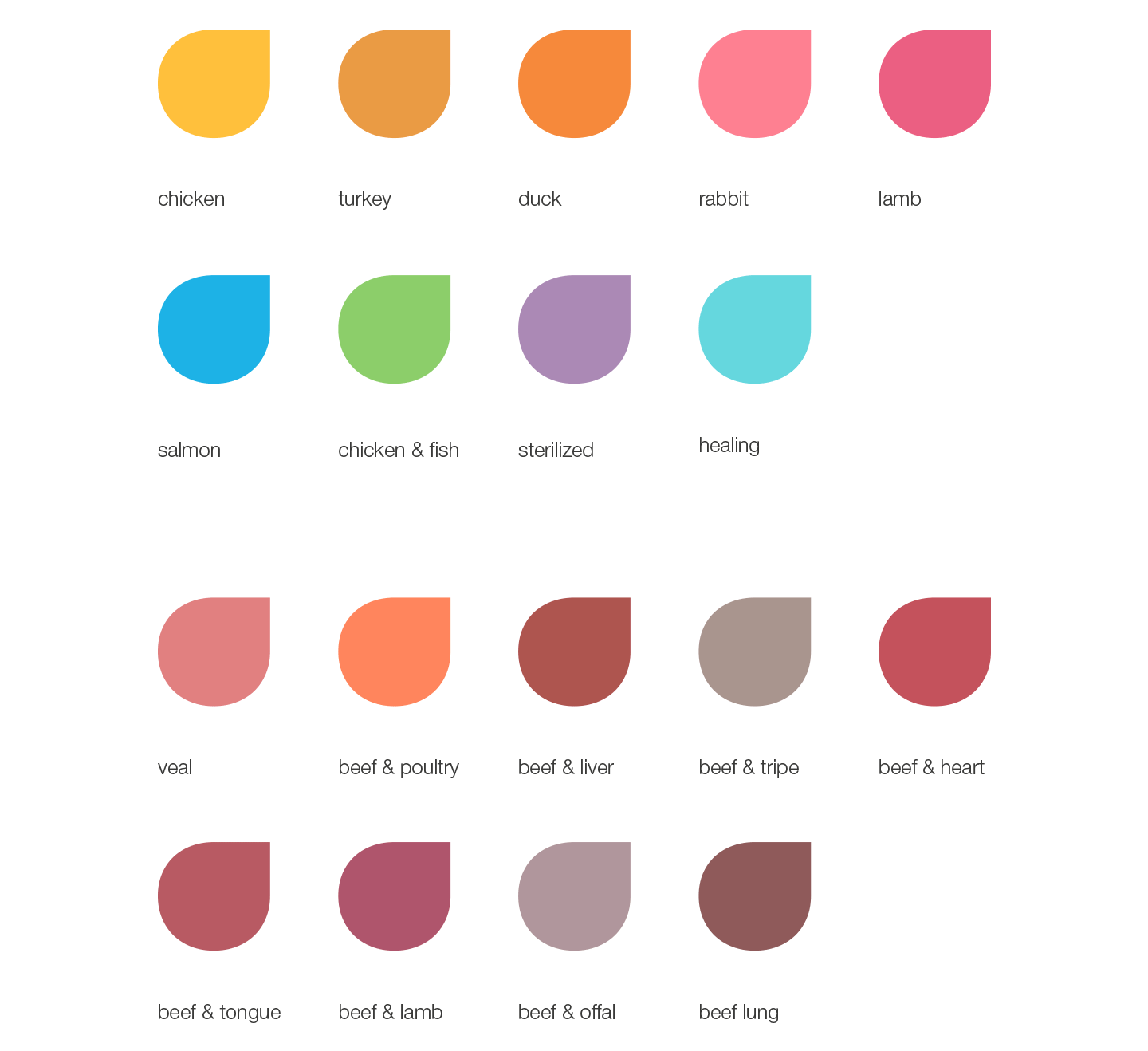
Colours
One of the most challenging tasks was the selection of colours for the final pallette. New shade should not compete with the previous one. The brand is expanding, so every new taste in the line makes us work hard to find the right colour.
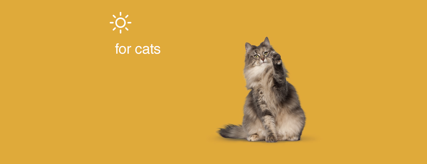
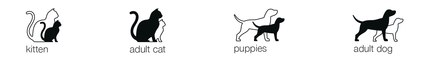
Icons
Tagline
To be continued soon
the project is in progress