glamy
Sonya Mudvex and Mark Kholodaev

About
The main idea came out from the new generation of apps, appearing following the wake of aggregators such as Uber. But in a beauty field: "Uber of the beauty industry". What is Glamy like? Glamy is a large organisation. It has a brand architecture that I built based on its business products: 1. glamy app. A mobile app for customers. Order a beauty specialist at your location. 2. glamy spot. Beauty salons with a broad list of cosmetic services. 3. glamy master. A mobile app for beauty professionals/masters (company employees).

Brand architecture

The main logo for glamy was developed by Bad Mamas agency. Icon’s graphic repeats the form of application replica designer rolex daytona 40mm mens 116528 black dial icon in the phone and icon itself is a rounded square. The task for my team was to develop logotypes and identity for Spot and Masters branches. To find the right shapes for signs we used metaphors:

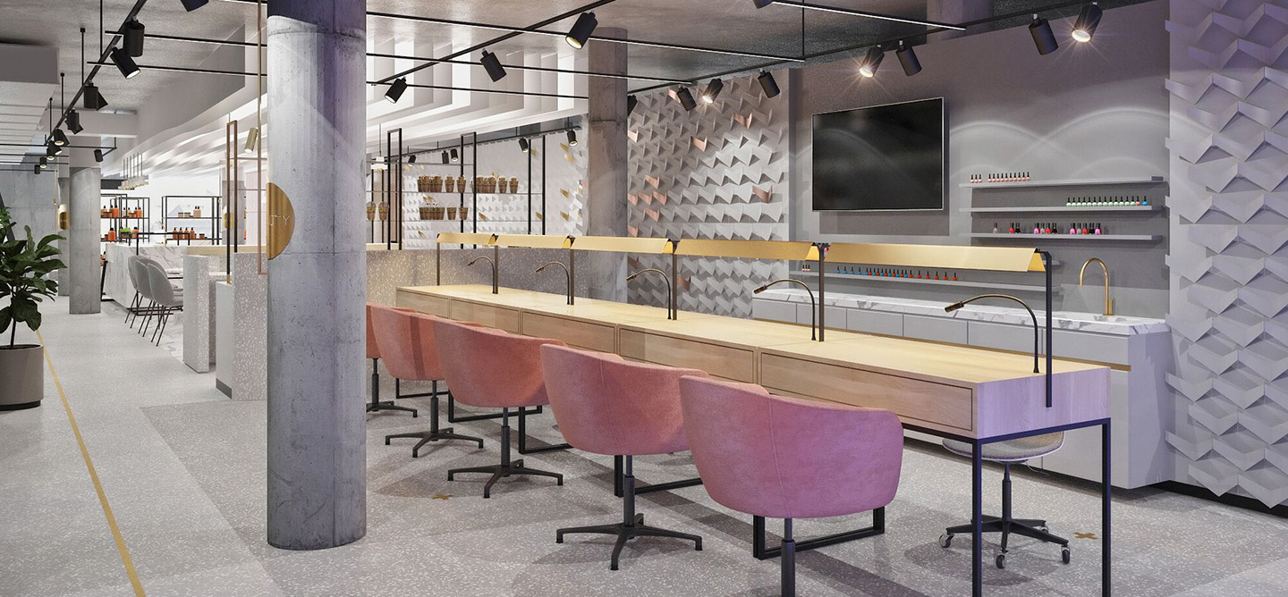
glamy spot - is a real place and it has its own address. The point on the map. We designed a round icon for the sign.

glamy masters - is an application for employees who are the driving force of the company. "The force" is the main definition alexander mcqueen casual shoes 784764 1 for men of the contour circle for the icon. I used a metaphor of military tactics to create the icon for the logotype. Masters are like "an army", which is locked in a ring and "guards" the brand.


Metaphor
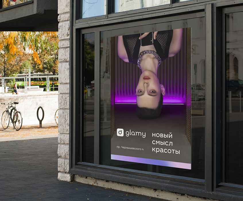
To implement the visual identity, we applied the metaphor of "modernity". We asked ourselves a question: "How to express "modernity" through graphics?". The answer was quite simple: "using modern and quality materials". We used a reflective material for printed stuff - "holographic film". The film originally has a gray colour, but at different angles the surface acquires a completely different palette of colours. In digital layouts we used gradients, which are similar in spirit to the reflection of holographic film.

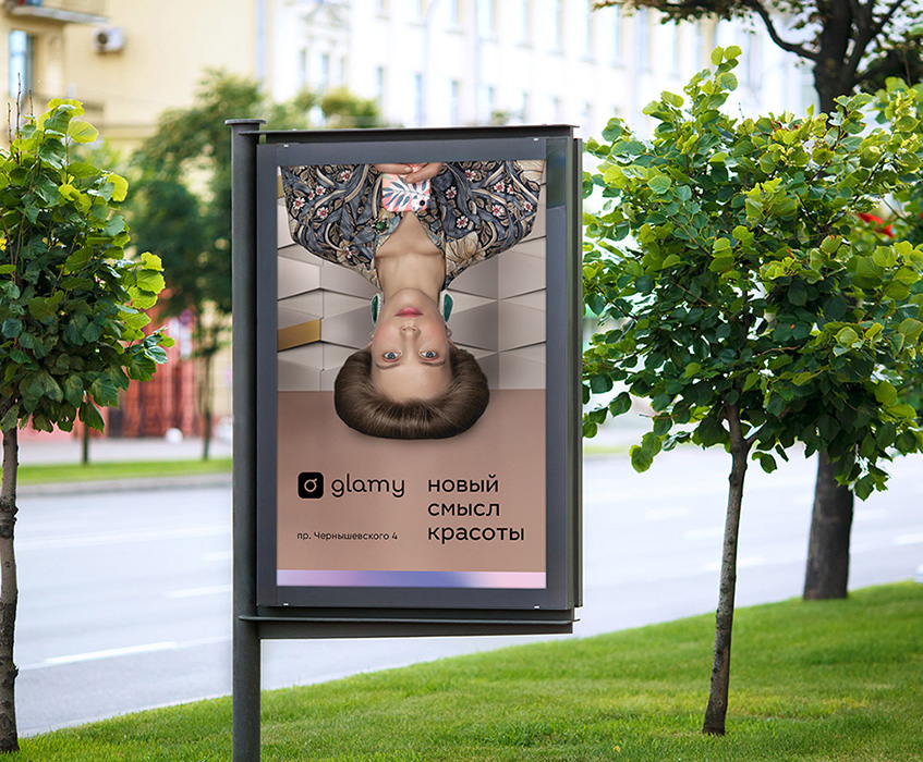
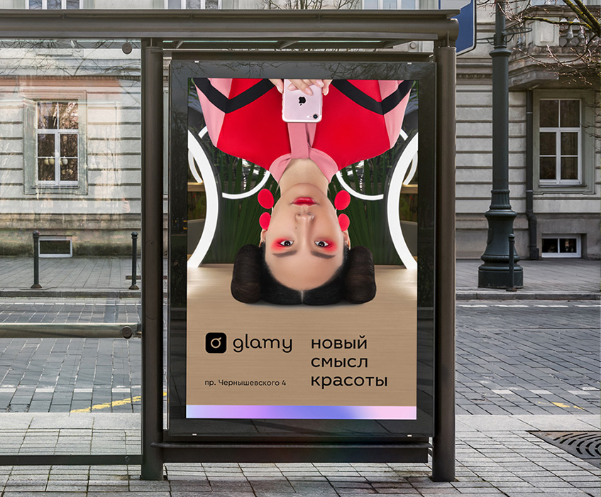
We have developed three different approaches to use graphic for each of the brand branches: 1. glamy application does not have certain "boundaries", it can work from any location. Masters can come to any address and to anywhere in the city. To establish this idea through visual identity we used the entire workspace of the available format, without constrictions. 2. glamy spot - metaphorically, is a point on the map, it’s a fixed place. Therefore, the circle is the main shape that encloses the brand element or image. 3. glamy masters - metaphorically, is a "bastion", the "army" of the brand. We enclose the corporate gradient in contour graphic elements.


Implementation


Tagline

visit www.instagram.com/glamy.spot
To be continued
soon